Step 60.
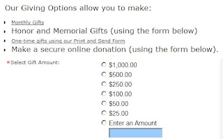
As we early discussed, the more specific you can be in presenting your fundraising offers the more money you will raise. The imagery and inspiring words used to compel someone to click through to your donation page must be apparent there as well or the donor may become less enthusiastic about following through on their intention of giving. This is example on the right is not considered best practice. You can see there is nothing compelling or specific, just dollar amounts.
 The example on the left is a little better because they use a drop down menu for designation but they are asking the potential donor to insert an amount with giving that person any specifics on what various amounts would do.
Here is an example of how to create an effective pre-donation page that translates all of the powerful creative which inspired a person to click through as a donor in the first place.

Step 61. Allow for User Generated Content
![]()
Thursday, January 19, 2012
Design an Inspiring Donation Page
Labels:
Charity,
Digital Fundraising,
Fundraising,
Nonprofit,
Todd Baker
Subscribe to:
Post Comments (Atom)


No comments:
Post a Comment